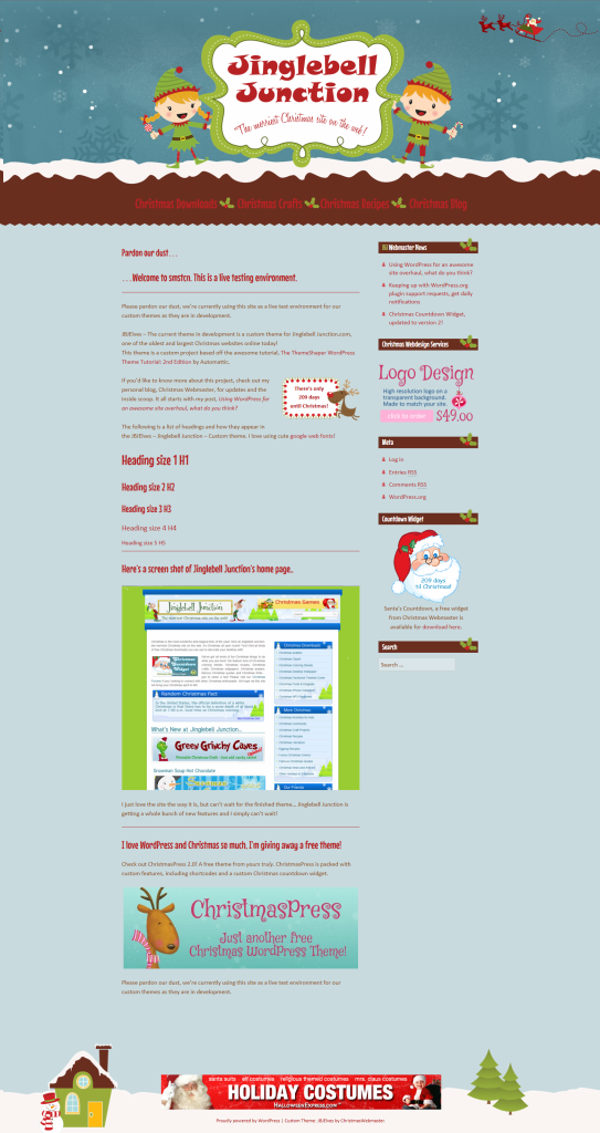
Last Monday I told you about an awesome site redesign that I’m going to be working on for the next month – A WordPress theme for my oldest Christmas site, Jinglebell Junction.
Since then, I’ve managed to get a lot of the design work out of the way – even though that’s completely opposite of my original plan of getting the functionality in place first. It’s nice to see it all coming together, I’m off to a great start but it’s not been a cake walk.
To get the ball rolling, my first stop was the WordPress theme development codex. Than a trip over to The ThemeShaper WordPress Theme Tutorial: 2nd Edition.
I already had a general color scheme in mind.. two blues, a deep red, green and brown.
 Things went well the first few days and I managed to get the basic theme files together and started on the graphics and the style sheet. By Wednesday, I had a functional theme with a really cute look happening.
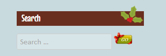
Thursday’s fiasco consisted of a straight 2 hours of hell trying to get the search button to display the way I wanted. Frankly, it’s still not exactly how I wanted it, I had to settle… but not really, I’ll just come back to it later 🙂

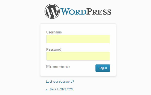
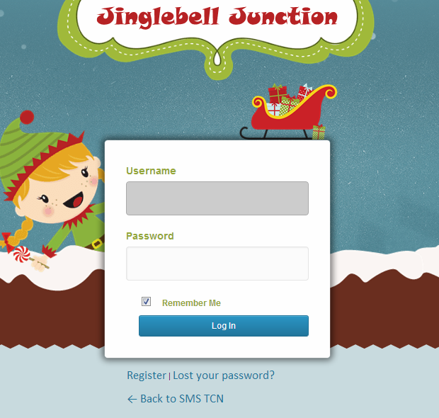
On Friday I worked on the login page. Since there are multiple users I want the login screen to match the site. Check out How To Customize The WordPress Login Page and this great tutorial How To Create A Totally Custom WordPress Login Page.
 The default WordPress login screen is just a little drab, so I took it from boring, to Christmassy!

I’m really happy with what I’ve got done so far. Have any suggestions? I’d love to hear what you think, so hit me up in the comments.


